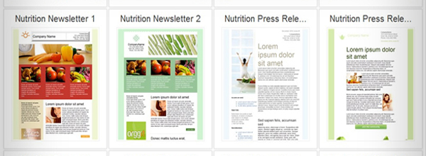
Real estate agents know the value “curb appeal” brings to showing and selling a home. That first impression the buyer gets when he/she steps out of the car and looks at the property you want to sell often determines whether the buyer will proceed and how seriously he or she takes the rest of the tour.
The same principle applies for email marketing campaigns – no matter what line of business you’re in. It all begins with the layout of the elements on the page, the font choice (don’t ever use all capital letters), even the colors you use, all create an impression before your prospect reads a single word of text. Remember, first impressions count.
You don’t have to be a professional designer or spend hours creating an
email marketing campaign that offers your readers curb appeal and lures them in. Here are some easy to implement tips to help you create a newsletter or email campaign that gives your readers the impression you want to make – that your
business could offer them a service they need or want and that you are a professional.
1. Keep it “clean.” Having a background image or a photo or your company logo in the background might look nice, depending on which email client your customers use, the background either won’t show up or will slow down the load time. Design your emails with a plain background, with perhaps a standard graphic embedded in the text, and use a legible font.
2. Make your point. When you put the email together make certain your most important points are made in the “preview” pane as many people won’t make it past there in their browser unless your information lures them in. The upper left corner of your email is the most important “real estate” in your message. Your main message and the “call to action” should be in that area of the message. Don’t start your message with a logo in the upper left corner – it is a waste of valuable space and if your customers have their graphics turned off all they will see is a large blank area. Use the upper left to engage them in conversation and give them a reason to open the email.
3. Don’t put navigation links at the top. If people open their email on a mobile device, a link at the top of the message is not HTML-friendly. Keep navigation simple and linking to a minimum.
4. Use legible fonts, layout and eye-friendly colors. Avoid reverse type (white type on a black or dark background) Keep your fonts dark on a white or very light background. Stay with safe fonts such as Arial, Times New Roman, Georgia, Verdana and Tahoma. Having your text aligned left is easier to read than a center justified text. You can use centering for headlines and subheadings but keep the body left justified.
5. Choose colors that complement your logo. Don’t rebrand yourself in your emails – if your company colors are blue and red, your email should follow the same theme.
6. Don’t overwhelm the reader with images. Don’t overwhelm your readers’ in-boxes with email messages that take forever to load because of large graphics – and also keep in mind that if your recipients open it on a mobile device, that’s another reason to keep them to about 72 dpi.
7. What’s your call to action? Are you having a sale? A grand opening? Offering a new product? Put your call to action in a bold text to call the readers’ eye to it. On a side note: mention these things in your messages on hold, as well. Your on hold messages can alert callers to specials and promotions they may not already know about.
Keep your email message/newsletter short and inviting. Also, make certain you offer the people on your distribution list an opt-out. Add some polish to your email campaign and you just might see some new sales!
Real estate agents know the value “curb appeal” brings to showing and selling a home. That first impression the buyer gets when he/she steps out of the car and looks at the property you want to sell often determines whether the buyer will proceed and how seriously he or she takes the rest of the tour. The same principle applies for email marketing campaigns, as well as on hold marketing campaigns – no matter what line of business you’re in. It all begins with the layout of the elements on the page, the font choice (don’t ever use all capital letters), even the colors you use, all create an impression before your prospect reads a single word of text. Remember, first impressions count.


 (888).641.2200
